React Native ile Mobil Uygulama Geliştirme – 13 – Multi-step Form Oluşturma

“React Native ile Mobil Uygulama Geliştirme” başlıklı makalelerimizden bir yenisini daha sizlerle paylaşmak istiyorum. Bu makale, bir dizi makaleden oluşacak olan serisinin 13. kısmıdır. Bir önceki makalede (Part 12), React Native’de Context API ve Hooks ile Simple Toast oluşturmayı ve mobil projelerimizde nasıl kullanacağımızı anlattım.

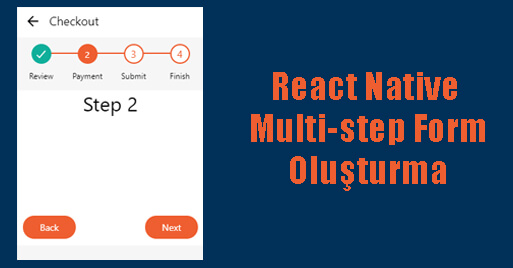
React Native’de multi-step form (step by step form) oluşturmayı ve mobil projelerimizde nasıl kullanacağımızı öğreneceğiz.

Daha önceki makaleleri okumadıysanız, lütfen buradan başlayın.

Bir müşteri için bir e-ticaret sitesi üzerinde çalışırken, ödeme sayfası için bir multi-step form üzerinde çalışmam gereken bir kısım vardı. İlk başta bunun için bir eklenti kullanabilirim diye düşünüyordum. Bu yüzden internette arama yaptım ama gereksinimlerimi karşılayan hiçbir şey bulamadım, bu yüzden kendim yaptım.

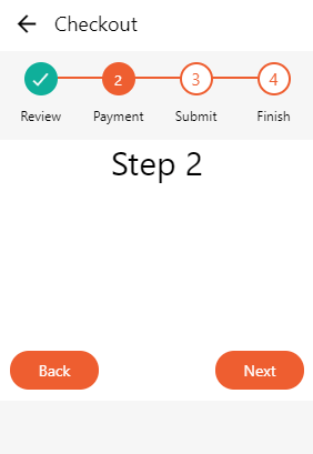
Fikir aslında çok basit, durum yönetimini kullanarak düğmelerin ve madde işaretlerinin nasıl görüntüleneceğini değiştirebilirsiniz. Ve biraz stil ile madde işaretlerinin nasıl çalıştığını vurgulayabilirsiniz. Onay işaretli yeşil madde işareti sayfanın tamamlandığını, gölgeli turuncu madde işareti o anda görüntülenen sayfayı belirtir ve ana hatları çizilen madde işaretleri henüz yapılmamış sayfaları gösterir. Siz kendi uygulamanıza göre kodları değiştirip deneyebilirsiniz.

import React from 'react';
import { StyleSheet, Text, View, TouchableOpacity } from 'react-native';
import { MaterialIcons, Ionicons } from '@expo/vector-icons';

export default class Settings extends React.Component {
	constructor(props){
		super(props);
		this.state ={
			currentStep: 1, /* using index 0 as starting point */
			steps: ['Review', 'Payment', 'Submit', 'Finish']
		}
	}
	
	render() {
		const styles = StyleSheet.create({
			centerElement: {justifyContent: 'center', alignItems: 'center'},
		});
		
		const { steps, currentStep } = this.state;
		
		return (
			<View style={{ flex: 1, flexDirection: 'column', backgroundColor: '#f6f6f6'}}>
				<View style={{flexDirection: 'row', backgroundColor: '#fff', marginBottom: 10}}>
					<TouchableOpacity style={[styles.centerElement, {width: 50, height: 50}]} onPress={() => {}}>
						<MaterialIcons name="arrow-back" size={25} color="#000" />
					</TouchableOpacity>
					<View style={[styles.centerElement, {height: 50}]}>
						<Text style={{fontSize: 18, color: '#000'}}>Checkout</Text>
					</View>
				</View>

				<View style={{alignItems: 'center'}}>
					<View style={{width: 280, height: 70}}>
						<View style={{alignItems: 'center'}}>
							<View style={{height: 2, backgroundColor: '#ee5e30', width: 180, position: 'absolute', top: 13, zIndex: 10}} />
						</View>
						<View style={{flexDirection: 'row', width: '100%', position: 'absolute', zIndex: 20}}>
							{steps.map((label, i) =>
								<View key={i} style={{alignItems: 'center', width: 70}}>
									{i > currentStep && i != currentStep && /* Not selected */
										<View style={{alignItems: 'center', justifyContent: 'center', width: 30, height: 30, backgroundColor: '#fff', borderWidth: 2, borderColor: '#ee5e30', borderRadius: 15, marginBottom: 10}}>
											<Text style={{fontSize: 15, color: '#ee5e30'}}>{i+1}</Text>
										</View>
									}
									{i < currentStep && /* Checked */
										<View style={{alignItems: 'center', justifyContent: 'center', width: 30, height: 30, backgroundColor: '#0faf9a', borderWidth: 2, borderColor: '#0faf9a', borderRadius: 15, marginBottom: 10}}>
											<Ionicons name="md-checkmark" size={20} color="#fff" />
										</View>
									}
									{i == currentStep && /* Selected */
										<View style={{alignItems: 'center', justifyContent: 'center', width: 30, height: 30, backgroundColor: '#ee5e30', borderWidth: 2, borderColor: '#ee5e30', borderRadius: 15, marginBottom: 10}}>
											<Text style={{fontSize: 13, color: '#ffffff'}}>{i+1}</Text>
										</View>
									}
									<Text style={{fontSize: 12}}>{label}</Text>
								</View>
							)}
						</View>
					</View>
				</View>
				
				<View style={{backgroundColor: '#fff'}}>
					{currentStep == 0 &&
						<View style={{height: 200, alignSelf: 'center'}}>
							<Text style={{fontSize: 30}}>Step 1</Text>
						</View>
					}	
					{currentStep == 1 &&	
						<View style={{height: 200, alignSelf: 'center'}}>
							<Text style={{fontSize: 30}}>Step 2</Text>
						</View>
					}	
					{currentStep == 2 &&	
						<View style={{height: 200, alignSelf: 'center'}}>
							<Text style={{fontSize: 30}}>Step 3</Text>
						</View>
					}	
					{currentStep == 3 &&	
						<View style={{height: 200, alignSelf: 'center'}}>
							<Text style={{fontSize: 30}}>Step 4</Text>
						</View>
					}
					<View style={{flexDirection: 'row', justifyContent: 'space-between'}}>
						{currentStep > 0 ?
							<TouchableOpacity style={[styles.centerElement, {bottom: 10, left: 10, width: 80, height: 35, backgroundColor: '#ee5e30', elevation: 10, borderRadius: 20}]} onPress={() => {
								if(currentStep > 0){
									this.setState({currentStep: currentStep - 1});
								}
							}}>
								<Text style={{color: '#fff'}}>Back</Text>
							</TouchableOpacity>
							: <Text> </Text>
						}
						{(currentStep+1) < steps.length /* add other conditions here */ &&
							<TouchableOpacity style={[styles.centerElement, {bottom: 10, right: 10, width: 80, height: 35, backgroundColor: '#ee5e30', elevation: 10, borderRadius: 20}]} onPress={() => {
								if((currentStep+1) < steps.length){
									this.setState({currentStep: currentStep + 1});
								}
							}}>
								<Text style={{color: '#fff'}}>Next</Text>
							</TouchableOpacity>
						}
						{(currentStep+1) == steps.length /* add other conditions here */ &&
							<TouchableOpacity style={[styles.centerElement, {bottom: 10, right: 10, width: 80, height: 35, backgroundColor: '#ee5e30', elevation: 10, borderRadius: 20}]} onPress={() => {
								console.log('Finish');
							}}>
								<Text style={{color: '#fff'}}>Finish</Text>
							</TouchableOpacity>
						}
					</View>
				</View>
			</View>
		);
	}
}


Ekran Çıktısı:

Lütfen bize görüşlerinizi bildirmekten çekinmeyin.

Kaynaklar:

1-https://www.npmjs.com/package/react-native-multistep-forms

2-https://zaferayan.medium.com/react-nativede-stepper-form-nas%C4%B1l-yap%C4%B1l%C4%B1r-e1eb58e5f0f3

3-https://reactscript.com/animated-multi-step-form-for-react-native/

4-https://carlofontanos.com/react-native-wizard-stepper/

React Native ile Mobil Uygulama Geliştirme – 12 – Context API ve Hooks ile Simple Toast Oluşturma

“React Native ile Mobil Uygulama Geliştirme” başlıklı makalelerimizden bir yenisini daha sizlerle paylaşmak istiyorum. Bu makale, bir dizi makaleden oluşacak olan serisinin 12. kısmıdır. Bir önceki makalede (Part 11), React Native’de Hooks ve FlatList ile Search Bar eklemeyi ve mobil projelerimizde nasıl kullanacağımızı anlattım.

React Native’de Context API ve Hooks ile Simple Toast oluşturmayı ve mobil projelerimizde nasıl kullanacağımızı öğreneceğiz.

React Native topluluğu, Toast adı verilen küçük mesajların gösterilmesini sağlayan çok sayıda kullanıma hazır kütüphane sunar. Ancak, bunu kendi başımıza uygulamak büyük bir çaba değil. Ek olarak, davranışlarının ve görünümlerinin tam kontrolünü elde ederiz. Context API ve hookları kullanarak böyle bir çözümü zaman kaybetmeden uygulayabiliriz.

Daha önceki makaleleri okumadıysanız, lütfen buradan başlayın.

Her şeyden önce, create context ve Provide bileşeni oluşturmamız gerekiyor.

import React, { createContext, useState, useEffect, useRef, useCallback } from 'react';

const initialToast = {
  message: '',
  type: null,
  visible: false,
};

export const ToastContext = createContext({});

export const ToastProvider = ({children}) => {
  const [toast, setToast] = useState(initialToast);
  const timeout = useRef();

  const show = useCallback(args => {
    setToast({...initialToast, visible: true, ...args});
  }, []);

  const hide = useCallback(() => {
    setToast({...toast, visible: false});
  }, [toast]);

  return (
    <ToastContext.Provider
      value={{
        hide,
        show,
        toast,
      }}>
      {children}
    </ToastContext.Provider>
  );
};

Bu context’te 3 adet anahtarımız var. İki tanesi toast mesajın görünürlülüğünü ve gizliğini sağlamak için, bir taneside toast mesajın state’ini almak içindir.

Şimdi Consumer bileşeni oluşturmamız gerekiyor:

import React, {useContext, useEffect, useRef} from 'react';
import {ToastContext} from './ToastContext';
import {
  Text,
  Animated,
  Easing,
  TouchableOpacity,
  StyleSheet,
} from 'react-native';

export const Toast = () => {
  const {toast, hide} = useContext(ToastContext);
  const translateYRef = useRef(new Animated.Value(-100));

  useEffect(() => {
    if (toast.visible) {
      Animated.timing(translateYRef.current, {
        duration: 300,
        easing: Easing.ease,
        toValue: 100,
        useNativeDriver: true,
      }).start();
    } else {
      Animated.timing(translateYRef.current, {
        duration: 450,
        easing: Easing.ease,
        toValue: -100,
        useNativeDriver: true,
      }).start();
    }
  }, [toast]);

  return (
    <Animated.View
      style={[
        styles.toast,
        {transform: [{translateY: translateYRef.current}]},
      ]}>
      <TouchableOpacity onPress={hide} style={styles.content}>
        <Text style={styles.toastMessage}> {toast.message}</Text>
      </TouchableOpacity>
    </Animated.View>
  );
};

export default Toast;

Burada mevcut toast durumunu almak için useContext hooks kullanıyoruz ve animasyonu useEffect hooks kullanarak çalıştırıyoruz. Ek olarak, kullanıcının Toast’ı tıkladığında kapatmasına izin veriyoruz.

Toast bileşenimize bazı stiller ekleyelim:

const styles = StyleSheet.create({
  toast: {
    borderRadius: 4,
    marginHorizontal: 16,
    padding: 4,
    position: 'absolute',
    top: 0,
    zIndex: 2,
    right: 0,
    left: 0,
    backgroundColor: '#ff3f3f',
  },
  content: {
    alignItems: 'center',
    flexDirection: 'row',
    justifyContent: 'center',
    minHeight: 32,
    width: '100%',
  },
  toastMessage: {
    color: '#fff',
    fontWeight: '600',
    fontSize: 12,
    letterSpacing: 0.26,
    marginHorizontal: 10,
  },
});

Ancak, ToastProvider’ın içine useEffect hook’u ekleyerek Toast sağlayıcımıza otomatik gizleme ekleyebiliriz.

useEffect(() => {
    if (toast.visible) {
      timeout.current = setTimeout(hide, 1500);
      return () => {
        if (timeout.current) {
          clearTimeout(timeout.current);
        }
      };
    }
  }, [hide, toast]);

Şimdi provider ve consumer’u uygulamaya bağlayabiliriz:

import React from 'react';
import AppNavigation from './AppNavigation';
import {ToastProvider} from './ToastContext';
import Toast from './Toast';

const App = () =>  (
  <ToastProvider>
    <Toast />
    <AppNavigation />
  </ToastProvider>
);

export default App;

Evet! Provider içine Consumer girişini koyabileceğimizi ve context’e yalnızca göster / gizle yöntemini gösterebileceğimizi biliyorum, ancak daha esnek bir çözüme sahip olmak istiyorum (Consumer’u uygulama yapısında istediğim yere koyabilirim)

Artık Tostumuzu istediğimiz ekrandan gösterebiliriz:

import React, {useContext} from 'react';
import {View, Text, TouchableOpacity, StyleSheet} from 'react-native';
import {ToastContext} from './ToastContext';

const HomeScreen = () => {
  const {show} = useContext(ToastContext);

  return (
    <View style={styles.container}>
      <TouchableOpacity onPress={() => show({message: 'Ama simple Toast!'})}>
        <Text>Show Toast</Text>
      </TouchableOpacity>
    </View>
  );
};

export default HomeScreen;

const styles = StyleSheet.create({
  container: {flex: 1, alignItems: 'center', justifyContent: 'center'},
});

Ekran Çıktısı:

Lütfen bize görüşlerinizi bildirmekten çekinmeyin.

Kaynak

https://selleo.com